

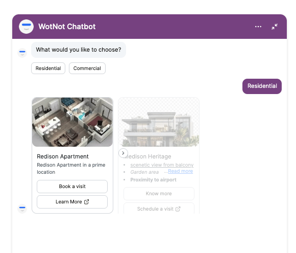
Only supported in the Web channel.
Using the Carousel block
Drag the Carousel action block onto the canvas and connect it to the next step in your flow. To add a card, click + Card and configure the card content and buttons.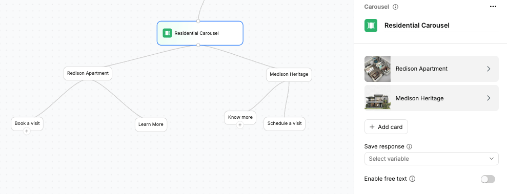
Configurations
You can add multiple cards to the carousel and configure each card individually.Card content
Each card can contain the following:- Image — The cover image displayed on the card.
- Card title — The title displayed on the card.
- Card description — A brief description of the item.
- Buttons — CTA buttons that let the visitor take an action.
Card buttons
You can add up to 3 buttons to each card.- Each button can use one of the following actions:
Branch
- Moves the conversation to the next connected step in the flow.
- Use Branch buttons when the visitor’s selection should determine what happens next in the chatbot flow.
URL
- Opens the specified URL in the visitor’s browser. The conversation flow ends at that point.
- Use URL buttons when you want to send the visitor to an external webpage.
Variables
Variables store the input received from the visitor so you can use the selected value later in the flow. You can select an existing variable from the dropdown or create a new variable.Only selections made using a Branch button are stored in the variable. URL button clicks are not stored as variable values.
Enable free text
Enable free text to allow visitors to either select one of the predefined buttons or enter their own response in the chat input. When enabled, a Free text node is added to the canvas. You can connect this node to an AI Agent action block to handle the visitor’s free-text response. This is useful when you want to provide predefined choices while still allowing visitors to enter a response that is not available as a button.