

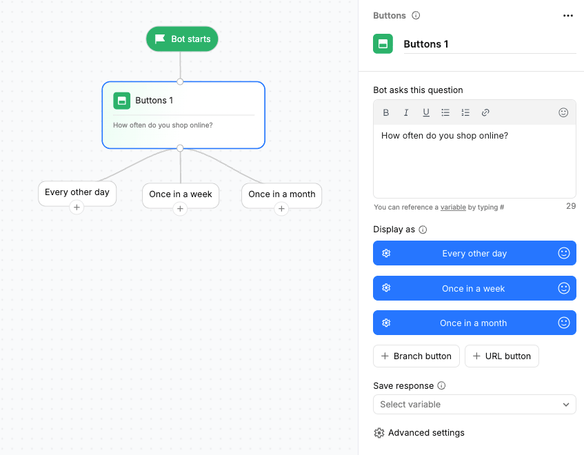
Buttons render natively on Web and Facebook Messenger. For WhatsApp, use Reply buttons instead. For longer flat lists, use Options. For grouped items on WhatsApp, use List.
Using the Buttons block
Drag the Buttons action block onto the canvas and connect it to the required step in your flow. Add the buttons you want to display. Each Branch button creates its own output path on the canvas.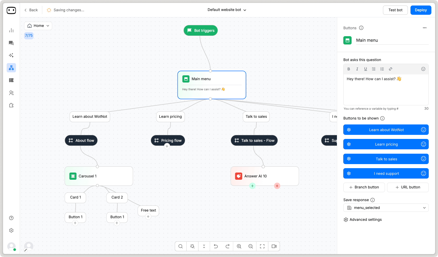
Configurations
Message text
The Message text is the question or message displayed above the buttons. Use it to tell the user what they need to choose. For example:What would you like to choose?
Buttons
Add the predefined options that you want to display to the user. Each button has its own label and can create a separate output path in the flow. You can reorder the buttons to control the order in which they are displayed. You can add up to 10 buttons in a Buttons action block.If you need to display more than 10 buttons, use the Dynamic data action block.
Button action
Configure what happens when the user selects a button.A Branch button creates a separate output path on the canvas. When the user selects a button, the conversation continues through the corresponding branch.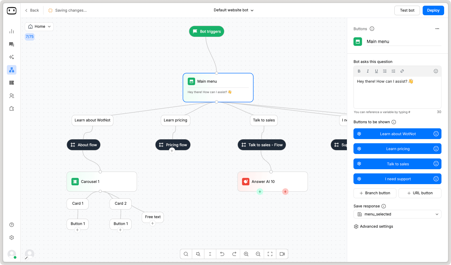
Save response
Save the button selected by the user to a variable so you can reference the selection later in the flow. Select an existing variable from the dropdown or create a new variable. Learn more about variablesOther configurations
Enable free-text
By enabling “Enable free text” option, users can either choose from predefined buttons or type their own response in the chat input. Also, on the canvas a new “Free text” node will be added, which can be connected to an AI agent action block for AI-generated responses. This allows for more natural, two-way conversations, and any free text entered can be handled by an AI agent for dynamic responses.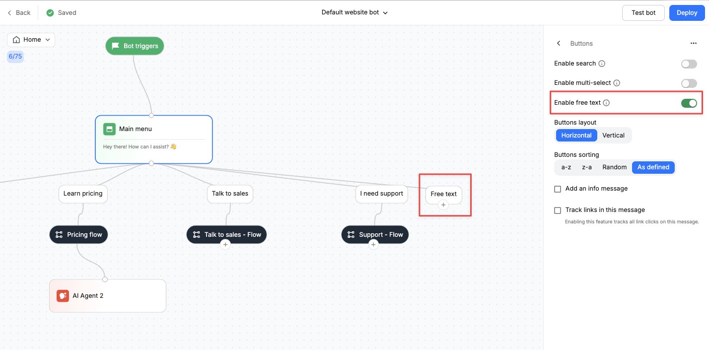
Enable Search
Enabling it displays a Search box above the list of buttons. This allows users to quickly find the option they are looking for when the list contains several choices.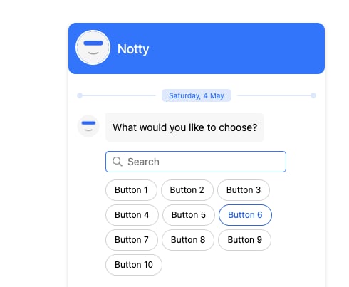
Enable Multi-select
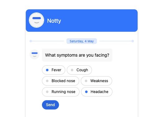
Enables users to select multiple buttons at the same time. After selecting the required options, the user must click Send to continue to the next step in the flow. When Multi-select is enabled:- The flow always routes to the Default branch.
- If a variable is configured, all selected values are stored as a comma-separated value.
Buttons layout
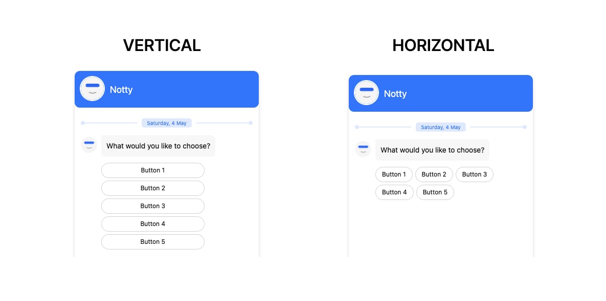
Renders the button in the specified format:- Horizontal – Horizontal placement of buttons as per available space.
- Vertical – Each item is displayed in a new line.
Buttons sorting
You can choose to sort the list of buttons in the following order:- A - Z – In an ascending order starting from A.
- Z - A – In a descending order starting from Z.
- Random – Button list will be randomized
- As defined – The order as displayed in the action panel.